Summarize, visualize, analyze
In my last post, I asked for feedback about what you’d like to learn about in our summer of figuring out the “so what?” of our data.
To my amusement, a longtime colleague and friend replied to my LinkedIn post with the following topic:
“How to turn raw data into meaningful information to make decisions. AKA how to think about data like Amanda does.”
So today’s post will give you a glimpse into the inner workings of my brain (just kidding, that’s kind of scary) and how I think through data once I’ve tracked it.
There are three main steps I take when I want to figure out what’s going on in a dataset: Summarize, Visualize, and Analyze. We’re going to talk through each.
1. Summarize it
Even with a nice, clean dataset that I’ve formatted it’s still hard to tell what’s REALLY going on there.
I need to use some formulas and functions to get a sense of the big picture.
I mean, look at the screenshot below (all fake data, don’t worry!) … I’ve got all my data in place, but I really couldn’t tell you anything about the trends or patterns that exist for my students.
As I talk about in my Data Tracking Guide (use the form at the end of this post to get your copy!), we need some rows and columns to tell us things like the count, sum/total, or average of the information.
While summary statistics don’t tell us everything (because there is always variation when you’re looking at data about people!), it gives us a good starting point to understanding what’s happening on a school- or class-level.
Take a look at the screenshot below and see what I mean.
Now, with some color, bold text, and simple formulas, I start to get a sense of what’s happening here.
Instead of my eyes crossing over this large amount of data, I can quickly see that my students’ math grades increased in Q4 from the previous quarters, which is important given that only 29% of my kids scored Proficient on the last state exam.
You can design this however you’d like, and you may not always need all of the same statistics for each column of your sheet, but this gives you an idea of how to get started.
2. Visualize it
You can visualize your data in lots of ways. You can use simple tools like Conditional Formatting to color-code and highlight different patterns in your data (see first picture below), or you can get fancy and start making charts, graphs, and dashboards (see second picture) that can help you quickly uncover patterns!
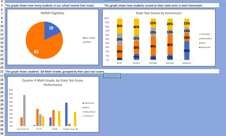
Look how much these graphs show us!
At a glance, I can see that Ms. Mellanby’s homeroom is kicking butt on their state tests and that Mr. Buzin’s room may need some more supports.
I can also see that overall, we have low percentages of students scoring Proficient on exams, even when they are doing pretty well in math class.
For me, the visualizing step is the most fun – we get to be creative and think about how different information interacts with each other and how it could best be displayed to give us the most insights.
3. Analyze it
Maybe it’s already obvious, but as I’ve done each step, I’ve already gotten the analytical juices flowing. I can’t help it!
As we start to uncover patterns in our data, we start to ask at least three questions:
– What am I really seeing in this data? Does this reflect what I observe in practice?
– Why are these trends occurring?
– What can we do about them?
Certainly, we can use these three steps with our family engagement data as well!
Are your summaries and graphs showing you who is engaging and who isn’t? What about which teachers are doing a great job promoting engagement in their classrooms?
The great thing about this process is that you can just explore! Be curious, try to look at things in different ways, and see what you learn.